

Process Mining in Power BI: Build Your First Process Map
Turn 54 event rows into a process map, find three routes through an order process, and trace a repeated step back to one order with Threadseer.
An order took eight hours to ship. Was it sitting in a queue, passing through an extra check, or going through the same step twice?
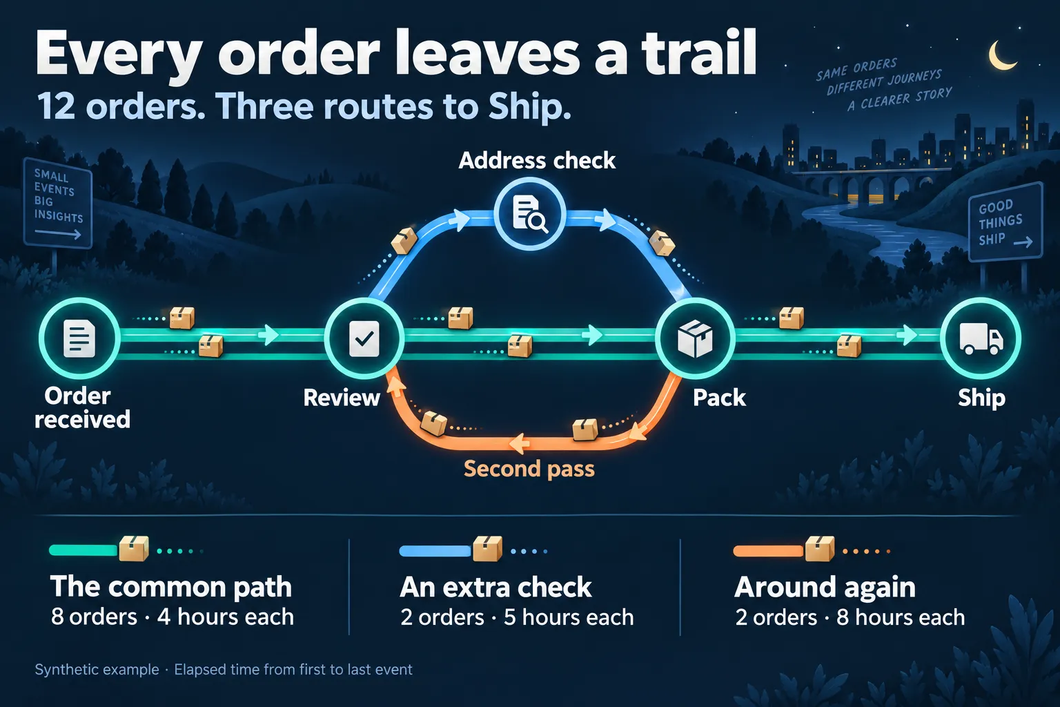
Read the three routes and times
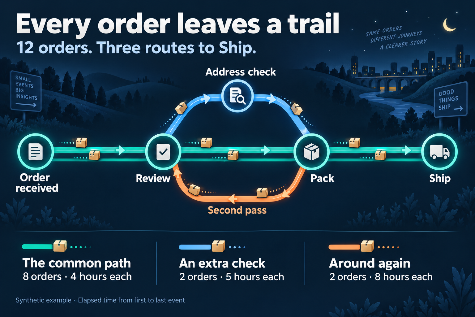
- The common path: 8 orders follow Order received → Review → Pack → Ship, taking 4 hours each.
- An extra check: 2 orders follow Order received → Review → Address check → Pack → Ship, taking 5 hours each.
- Around again: 2 orders follow Order received → Review → Pack → Review → Pack → Ship, taking 8 hours each.
Times measure elapsed time from the first recorded event to the last.
A total tells you how long it took. The recorded sequence tells you what happened along the way. Process mining in Power BI starts with those records: one row for each event, connected to the order, ticket, or other case it belongs to. A process map brings the observed routes together so you can see the common path, branches, and returns.
In this walkthrough, you will import a small order-fulfillment sample, build its map with Threadseer, and follow one repeated step back to the events behind it. You do not need a separate process-mining platform or a Professional license for this example.
Get the sample
The sample contains 54 events across 12 orders, with five distinct activities and three routes. It is deliberately small enough to check by hand. All orders reach Ship; there are no missing timestamps or tied timestamps within an order.
You need Power BI Desktop, permission to add custom visuals, and Threadseer. Community supports up to 25,000 event rows per analysis, so this example is comfortably within its limit. See the current plan guide for larger datasets.
The sample uses only the three required fields:
- Case ID
- Which order?
ORD-001Repeats on every event for that order. - Activity
- What happened?
ShipNames one recorded step. - Timestamp
- When did it happen?
13:00 UTCPlaces the step in sequence.
For example, the first four rows describe one order, not four orders:
| Case ID | Activity | Timestamp (UTC) |
|---|---|---|
| ORD-001 | Order received | 2026-09-14 09:00 |
| ORD-001 | Review | 2026-09-14 10:00 |
| ORD-001 | Pack | 2026-09-14 12:00 |
| ORD-001 | Ship | 2026-09-14 13:00 |
The downloadable file stores timestamps in ISO 8601 format with an explicit UTC time zone, such as 2026-09-14T09:00:00Z. The table above uses a shorter display of those same values.
UTC is just this sample’s convention. You can supply timestamps in the time zone that suits your data; Threadseer analyzes the timestamp values Power BI provides. If you supply timestamps as text, include an explicit offset, such as 2026-09-14T09:00:00-05:00.
Load the event rows
In Power BI Desktop, choose Home → Get data → Text/CSV, then open the downloaded file. In the preview, set Data Type Detection to Do not detect data types, then choose Load.
That keeps all three columns as text, including the timestamp’s time-zone information. Threadseer reads these ISO timestamps directly, so the sample is ready to map.
Map three fields
In the Visualizations menu, choose Get more visuals. Search for Threadseer by Wittenauer Software LLC, choose Add, and select its icon to place it on the report canvas. You can also start from the Microsoft Marketplace listing. If your organization restricts custom visuals, check the approved installation path with your administrator.
For this walkthrough, we recommend a report canvas 2,000 px high. Click an empty area of the page, open Format page → Canvas settings, choose Type: Custom, and set Height to 2000. Resize Threadseer to use the extra space, and choose View → Page view → Fit to width to keep the taller page readable as you scroll.
Select Threadseer and assign the sample columns to these field wells:
- Case IDGroups events for the same order.
- Case ID
- ActivityThe recorded step, such as Ship.
- Activity
- TimestampThe date and time of that step.
- Timestamp
Your source columns can have different names; assign them to the same three roles.
For every assigned field, use Don’t summarize where Power BI exposes the setting. For Timestamp, select the actual column rather than Date Hierarchy. A summarized value or a date hierarchy changes the event rows Threadseer receives.
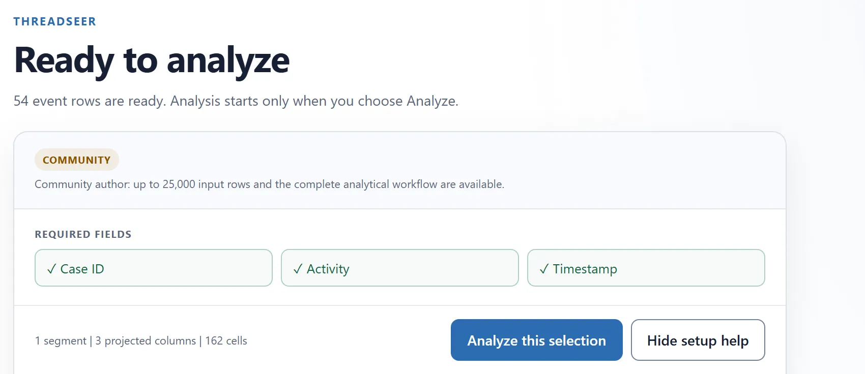
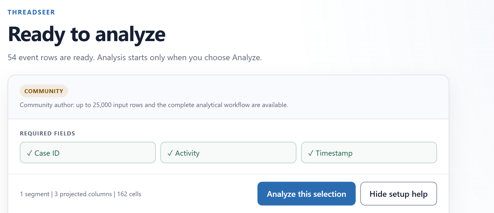
The readiness screen should show 54 event rows and all three required fields checked. Choose Analyze this selection.
Read your first map
Threadseer opens Process Map. For the unfiltered sample, the summary should show 12 cases, 3 observed variants, 4.0 hr median throughput, and 16.7% rework. Here, throughput is the elapsed time from each order’s first recorded event to its last. Two of the 12 orders repeat an activity.
Before looking for the loop, set Path scope to Case coverage, Top case coverage to 100%, and leave Minimum cases at 1. The initial 80% coverage setting shows enough whole variants to cover 83.3% of these orders; it leaves the repeated-step route out of the displayed map. Increasing coverage reveals all three routes.
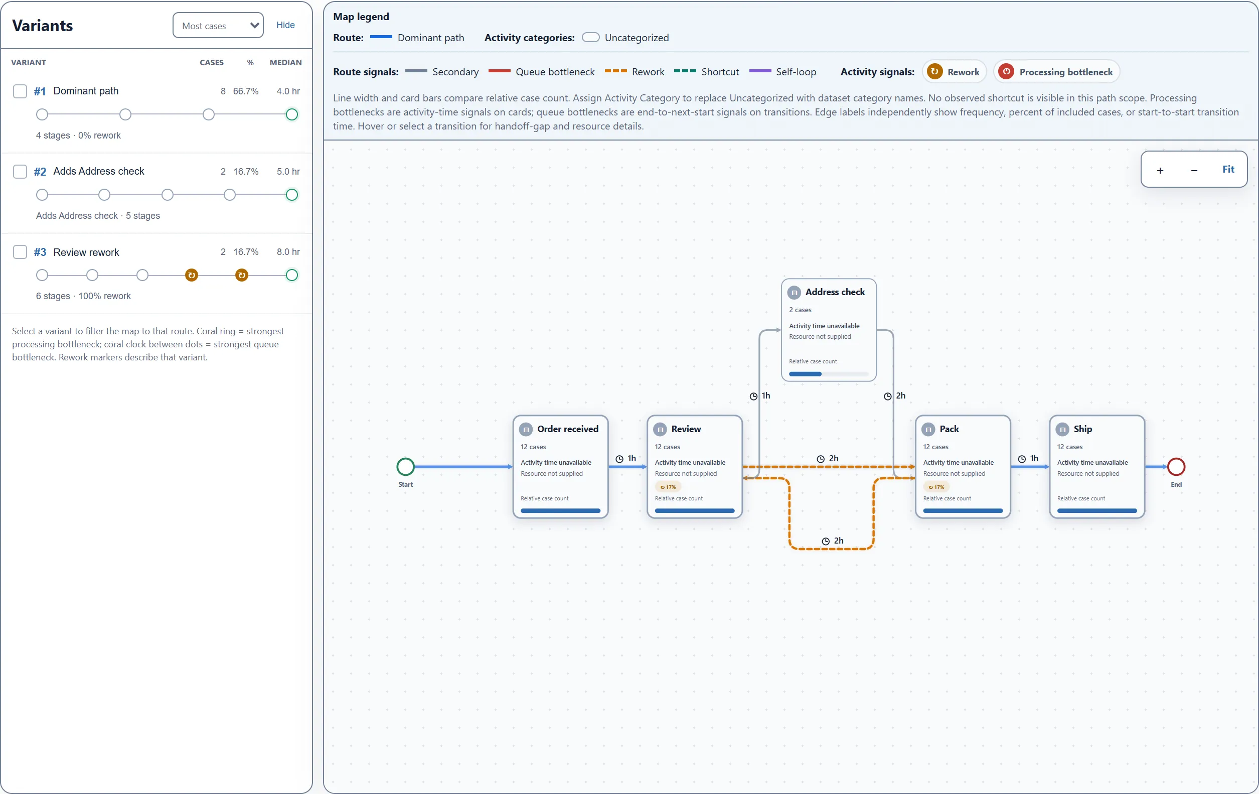
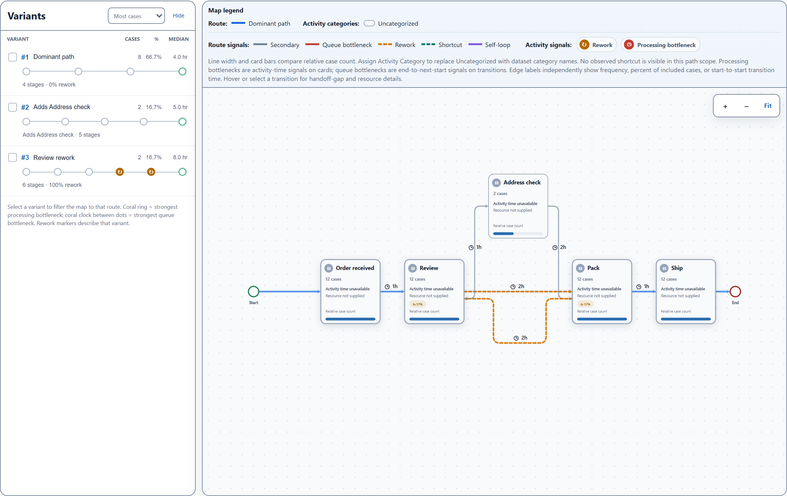
Read the map in three passes:
- Find the common route. Eight orders follow Order received → Review → Pack → Ship. That is 66.7% of the sample. A discovered map describes what was recorded; it is different from a flowchart you draw to describe the intended process.
- Look for branches and returns. Two orders pass through Address check. Two others return from Pack to Review before packing again. A less-common route is worth understanding, but it is not automatically an error.
- Check what the labels measure. With Metric: Case count, the Review card includes 12 distinct orders even though Review occurs 14 times. Change Metric to Event count if you want activity occurrences. With Edge labels: Time, clock labels show average elapsed time between recorded activity timestamps. Frequency, % of cases, and Median transition time are alternative edge labels.
Select a map card or line to highlight its related paths. This is a local exploration of the map. Explicit variant and case selections can also filter other report visuals when report interactions are enabled.
Follow one order
Open Cases, search for ORD-011, and select its Case ID. Its timeline should contain six events and span eight hours. Power BI and Threadseer may display those timestamps in local time; the illustration below keeps the CSV’s UTC times so you can compare them directly.
- Order receivedFirst event
- ReviewFirst pass
- PackFirst pass
- Review Second pass
- Pack Second pass
- ShipLast event
6 recorded events2 repeated activities8 hr first to last
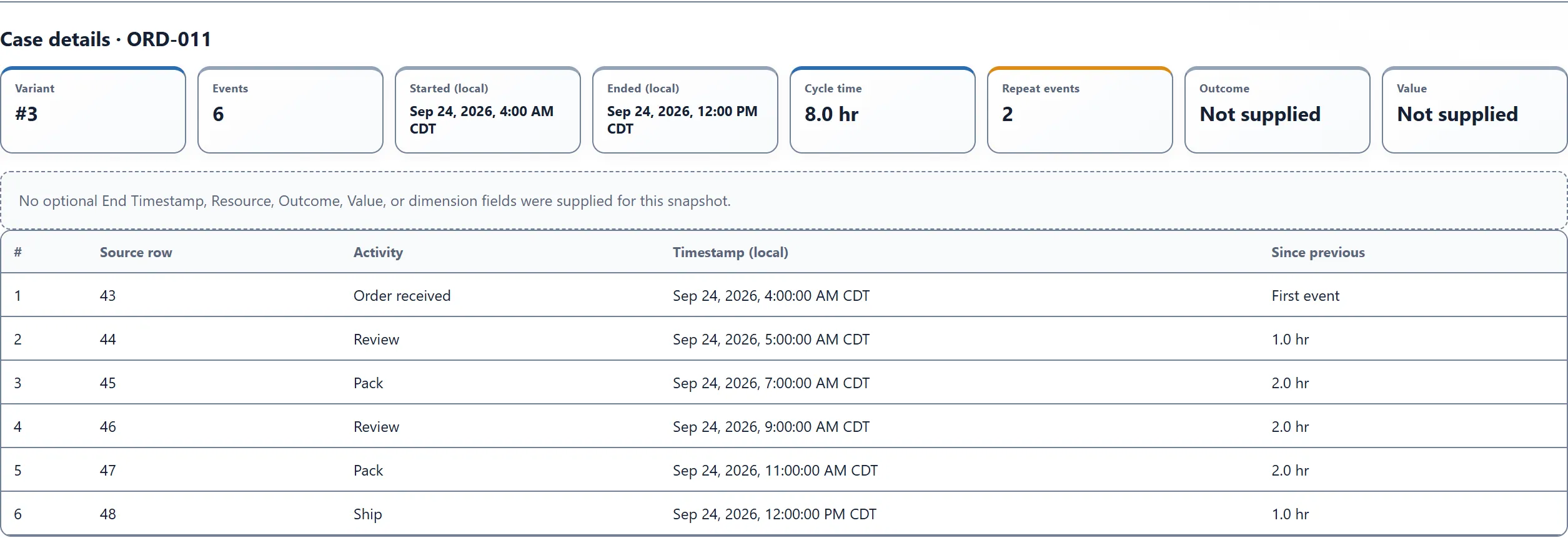
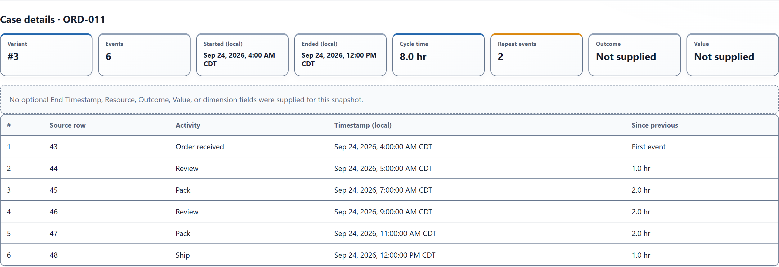
Compare that sequence with ORD-001, which has four events and reaches Ship in four hours. The extra passes and longer elapsed time are visible. The log does not tell you why the second review happened. It could have been a correction, a required check, or a recording problem. That is the next question to take back to the process owner.
This is a useful first investigation: start with a pattern in the map, then inspect the cases that support it.
Try your own data
Choose one process and a manageable period. Orders, service tickets, invoices, and claims can all work when you have their event histories.
Keep one row per event. If your source has Received Date, Reviewed Date, and Shipped Date in separate columns, use Power Query to unpivot those milestones into Activity and Timestamp rows. The getting-started guide explains the required shape and optional fields.
Before analyzing, check these four things:
Keep the case intact
- Use a Case ID that identifies one process instance, with all its relevant events.
- Keep one row per occurrence. If exact duplicate event rows are legitimate, map a unique Event / Row ID so Power BI can preserve them.
Keep the sequence trustworthy
- Use consistent activity names and precise timestamps with a clear time-zone convention.
- Check missing events, incomplete cases, and timestamp ties before treating the map as a complete history.
If your result looks wrong, work backward from the input:
- Threadseer is not available to add: check your organization’s custom-visual policy and the installation options.
- The readiness count differs from the source: inspect report filters, field aggregation, Date Hierarchy, and event-row uniqueness.
- Fewer events survive analysis: open Data Quality and inspect excluded rows and timestamp problems.
- A route is missing: check map coverage, Minimum cases, and any selected variants or cases.
- Results still describe your previous filters: choose Analyze new selection or the displayed Reanalyze action. Changing Power BI data or filters requires an explicit new analysis.
For a follow-up investigation, compare the routes in Variants or Compare, or use Rework to explore repeated steps. More detailed delay and variant walkthroughs will build on this same sample.